Thursday, December 12, 2013

Exercise 10: Graphic Simplicity


Minimalism: A design or style in which the simplest and fewest elements are used to create the maximum effect
White space: The unprinted area of a piece of printing, blank space
Graphic simplicity: graphic has the simplest elements needed to convey what it is without extra details


This is an example of white space used as the apple and type take up a minimal amount of area with the rest being blank. It also has minimalism as there is only one element, the apple, that conveys the message of the company, Apple.

This image has to do with graphic simplicity as very simple shapes and colors are used to create the images, but it is still comprehended as the Bat Signal. It also has white space, the black area around the light, that is not filled in, but still can be perceived as the night sky.

This last one has a fair amount of blank whtie space around the image. It also has graphic simplicity because the boy's figure is made of basic shapes. It also has minimalism in the type as the message is very simple, but clear...and funny.

Tuesday, December 3, 2013

Exercise 9: Page Design


I decided to use a bold, sleeve design and a grid of photos for my page design. I decided to stick with the hedgehog theme, but had trouble finding pictures big enough to fill a page. I didn't really know what else to do because a lot of the other designs I tried didn't work out very well because of image size or I didn't quite figure them out completely.
I used Photoshop for this because I do not know how to use InDesign. I put a half inch margin around the page at first and then placed a two and a half inch sleeve. My largest image is about 5 inches and the second largest is about three and a half. My type is Bernard MT Condensed because I wanted to get close to the logos type, but I knew I couldn't match it. The color of the sleeve is from the second largest picture (A2?). I edited the "Santa hat" hedgehog picture because it was a little dark.

Tuesday, November 19, 2013

Exercise 8: Creating Focal Points

For this exercise I decided to use Hedgehog Central Forums to create my advertisements. I mainly picked this because I have been on the forums a lot lately trying to find something that can help my sick hedgehog, Samson. The first image is my Facebook banner. I used the Gradient spotlight to place focus on the hedgehog and lined up my text on the opposite side of the image. I felt that using the spotlight was the easiest because you can still see the flowers and such in the background, giving an idea of where the hog is, but the spotlight also allows for the main focus to be the hedgehog even more than it was before.
For my second image, I used a blurred background to place focus on the hedgehog. The focus on it's size from the previous image is still there, as the egg can be seen from the background, but the hedgehog stands out in front of the egg, placing more focus on it rather than the size.
My final one I had trouble deciding what to do. I ended up using a blur to focus in on the faces of the hedgehogs and using a color match to the quills of the hogs to make an ellipse around the logo to focus in on that.  In the end, there are two focal points, but I really did not know how to do that one because of the wideness compared to the height.
My last image is Samson at my job. Just because...

Facebook
Half Page
Web

Tuesday, November 5, 2013

Exercise 7: Many From One

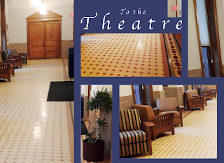
I had walked around campus taking pictures at my free will. The outside ones turned out like crap because of my phones crappy camera. I had taken this one on a whim during one of the may times I am waiting for the elevator or when I am living in this hallway for endless rehearsals. I decided to pick this one over the other ones I had taken because there is a lot going on and it was the least blurry. I decided to use a Complementary color for my background because I feel like to makes the photos stick out more from the background. Also, that would be a lot of brown/beige if I had used a monochromatic color, as shown in the third picture. I also edited the blue one after critique.
The color for the type I stole from the light in the picture and I tracked the type to make it fit in with the dimensions of my photos. I wanted my largest image to be the door because I feel like that is the main focal point of the photo.

Original


Thursday, October 31, 2013

A Midsummer Night's Dream Poster Contest!

Hey, so I had decided that I would submit a design for Little Theatre's Poster contest. We have one every show and this one is for A Midsummer Night's Dream. 
I actually won and I wanted to post my poster one here! The first design is what I submitted and the second one is after Alex Re helped me tweek it based on the EBoard's suggestions. (You should probably give Alex extra credit in all of his classes!)
Submitted Poster

Final design for show

Thursday, October 10, 2013