Thursday, December 12, 2013

Exercise 10: Graphic Simplicity


Minimalism: A design or style in which the simplest and fewest elements are used to create the maximum effect
White space: The unprinted area of a piece of printing, blank space
Graphic simplicity: graphic has the simplest elements needed to convey what it is without extra details


This is an example of white space used as the apple and type take up a minimal amount of area with the rest being blank. It also has minimalism as there is only one element, the apple, that conveys the message of the company, Apple.

This image has to do with graphic simplicity as very simple shapes and colors are used to create the images, but it is still comprehended as the Bat Signal. It also has white space, the black area around the light, that is not filled in, but still can be perceived as the night sky.

This last one has a fair amount of blank whtie space around the image. It also has graphic simplicity because the boy's figure is made of basic shapes. It also has minimalism in the type as the message is very simple, but clear...and funny.

Tuesday, December 3, 2013

Exercise 9: Page Design


I decided to use a bold, sleeve design and a grid of photos for my page design. I decided to stick with the hedgehog theme, but had trouble finding pictures big enough to fill a page. I didn't really know what else to do because a lot of the other designs I tried didn't work out very well because of image size or I didn't quite figure them out completely.
I used Photoshop for this because I do not know how to use InDesign. I put a half inch margin around the page at first and then placed a two and a half inch sleeve. My largest image is about 5 inches and the second largest is about three and a half. My type is Bernard MT Condensed because I wanted to get close to the logos type, but I knew I couldn't match it. The color of the sleeve is from the second largest picture (A2?). I edited the "Santa hat" hedgehog picture because it was a little dark.

Tuesday, November 19, 2013

Exercise 8: Creating Focal Points

For this exercise I decided to use Hedgehog Central Forums to create my advertisements. I mainly picked this because I have been on the forums a lot lately trying to find something that can help my sick hedgehog, Samson. The first image is my Facebook banner. I used the Gradient spotlight to place focus on the hedgehog and lined up my text on the opposite side of the image. I felt that using the spotlight was the easiest because you can still see the flowers and such in the background, giving an idea of where the hog is, but the spotlight also allows for the main focus to be the hedgehog even more than it was before.
For my second image, I used a blurred background to place focus on the hedgehog. The focus on it's size from the previous image is still there, as the egg can be seen from the background, but the hedgehog stands out in front of the egg, placing more focus on it rather than the size.
My final one I had trouble deciding what to do. I ended up using a blur to focus in on the faces of the hedgehogs and using a color match to the quills of the hogs to make an ellipse around the logo to focus in on that.  In the end, there are two focal points, but I really did not know how to do that one because of the wideness compared to the height.
My last image is Samson at my job. Just because...

Facebook
Half Page
Web

Tuesday, November 5, 2013

Exercise 7: Many From One

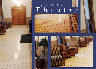
I had walked around campus taking pictures at my free will. The outside ones turned out like crap because of my phones crappy camera. I had taken this one on a whim during one of the may times I am waiting for the elevator or when I am living in this hallway for endless rehearsals. I decided to pick this one over the other ones I had taken because there is a lot going on and it was the least blurry. I decided to use a Complementary color for my background because I feel like to makes the photos stick out more from the background. Also, that would be a lot of brown/beige if I had used a monochromatic color, as shown in the third picture. I also edited the blue one after critique.
The color for the type I stole from the light in the picture and I tracked the type to make it fit in with the dimensions of my photos. I wanted my largest image to be the door because I feel like that is the main focal point of the photo.

Original


Thursday, October 31, 2013

A Midsummer Night's Dream Poster Contest!

Hey, so I had decided that I would submit a design for Little Theatre's Poster contest. We have one every show and this one is for A Midsummer Night's Dream. 
I actually won and I wanted to post my poster one here! The first design is what I submitted and the second one is after Alex Re helped me tweek it based on the EBoard's suggestions. (You should probably give Alex extra credit in all of his classes!)
Submitted Poster

Final design for show

Thursday, October 10, 2013

Thursday, October 3, 2013

Exercise 3: Page Canvas

http://creativexcess.com/page/58/

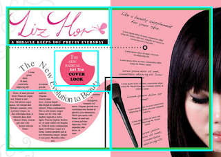
I went onto Google Images and found this image. The green square indicates the margins. The blue squares indicate a quasi-golden ratio, where half of the page is A1, another part of the page is A2 and so on. I thought the brush, squared in black was the focal because it travels between the two major sections of the page. The brush also extends the pink onto the white, with the pink being the home of a section of text. The woman could also be a focal point, but I would categorize her as more secondary because she resides only in A1.

Tuesday, October 1, 2013

Let's Discuss DMA

A little background on me, I am a music major as well as a DMA major. Obviously graphic design is not my thing, but I have to take this class as part of the major requirement. I really want to get into more film and audio classes but I am starting to understand the purpose behind why a musician should take this. For one, it has been teaching me how to be more picky in every piece of art I do. I am also getting mroe adapt at using a Mac in general. To be honest, I am coming into this class knowing nothing about design and all I know about photoshop and illustrator was from my DMA 201 class, so it is pretty limited.
For color, I am learning about which colors I can use in other media to make my subject stand out more and to depict a mood. If I have a person in all dark clothing, putting them in a grey scale could depress the mood or putting them in a colorful background could make them stand out more and lighten up the mood. It could also depress the mood of the person while making the background more content.

This post will be edited as I learn more in this class...it is really just a reflection.

Thursday, September 26, 2013

Exercise 4: Book Covers

Analogous

Compliment
Split Compliment
I decided to do A Midsumer Night's Dream for this assignment. Not because it is my favorite book, but because Little Theatre is doing it for their mainstage. I decided that my background should go with the greens in the trees and that I would adjust my type to complete the assignment. For my split compliment, I decided to move my type around in order to properly see the letters in the dark background. I liked the tilting of the words, but I could not figure out how to make the book title stand out more than "William Shakespeare." I think this may be something that I have to work on in the end. However, I enjoy the look of monochromatic designs and I find myself using that design subconsciously when I am fooling around with Photoshop and Illustrator. I like the compliments and the split. I think I could have used the orange in the sky for my background and it would have worked out better for me, but I am very stubborn and I like how the image blends into the background, making the sky and subtle color changes in the image stand out more.

Note: I lost the image I used in the Google Universe. I will find it when I have more time.
Note 2: I am playing Puck in Little Theatre's "A Midsummer Night's Dream"
Analogous

Complement
Split Compliment
Tetrad
After the class discussion on October 1, 2013,  I decided to do something different. First of all I saved the image to a PNG file. I also decided to design my own cover for "Harry Potter and the Deathly Hallows" on illustrator.  I made it pretty simple because I just wanted to get some more practice with color and with margins. I also just really like simple designs because they do not take away from the subject that you are talking about. Because this is the "Deathly Hallows," I decided that the minimum of that symbol would be needed, not some grand painting of Harry on an albino dragon flying over London. I really liked the compliment scheme because of the influence of green and red in the series. I could go into this, but we do not have that much time. I also decided to experiment with the tetrad color scheme because it had the color of all 4 houses in the Harry Potter universe. It was really just for funzies.

The font was from http://www.dafont.com/harry-p.font
Not sure if I could use this legally...

Lastly I decided to get even more comfortable with the pen tool and with color schemes and drew this out for my brother, who is graduating from college in May, 2014. I  used a monochromatic color scheme and while it could still use some work; there are some angles I could fix, some gradient things and some other type things, I am proud of my work. My brother now has this as his cover photo on Facebook and it has 31 likes as of 3:10pm on October 1, 2013.

Sunday, September 15, 2013

Exercise 2: Image Based Layouts

 I had picked this photograph because I liked the contrast between the color of the wheat and the color of the sky. I also liked how the structure seamed to be evolving out of the wheat and how it was the main focus of the picture aside from the detail in the wheat and the clouds in the sky. I tried to use the same organic circular shape with the shape of my text, as the side molds in on the center and the outside matches up with the edge of the photograph. I also wanted to use a more organic shape with my title in order to make it stand out more. I also utilized the colors in the sky in my body text and the color of the wheat in my title text.


http://m12studio.org/open-space

Thursday, September 5, 2013

Exercise 1: Grid

For some reason this exercise didn't make a lot of sense to me at first. Yes it is important to know where the grid tool is and yes it is important to know where the focal points are, but I feel like the grid is a simple helper for finding what maybe your eyes couldn't see. I feel like if the grid is really necessary, then the focal points are not as obvious as one may think, which in the case of busy pictures, may actually be necessary. However, the type of grid can put different things into focus. Instead of only seeing one thing, one can see something in the background that also has value. It does not undermine the grid or place it in a place of strictest importance where it must be used in all situations. It merely uses the grid as a tool to find the importance and lays it out in a clearer way.


http://abstrac-paintings.blogspot.com/2013/02/oil-painting-abstract.html
http://rizzamaruja.files.wordpress.com/2011/03/6.jpg

Monday, September 2, 2013

Classwork 1: Sketchbook Assignment

To be completely honest, I am terrible at drawing or sketching, however I do understand the importance of it. It is important to have an idea of what you want to do before you jump into a project. Normally I would just jump into a project and see where it takes me, because I change what I want daily. I have trouble thinking of designs on the computer, but I do find it easier to think of designs for knitting, so maybe I can transfer some of that knowledge to computer designs. The thing is, I am a musician, so going into film and audio production is more for me, but doing sketches for that also has it's importance. Potentially, exercises like these could help me find ways to develop and organize my ideas more. I think I enjoyed drawing the dancing stick figures more than anything because I like the movement. I also enjoyed the web of ideas. I did mine on what to do when my boyfriend is annoying me and it gave me a lot of amusement and expanded my wreath of knowledge of what I could do in different situations.